Posts

Conceptual design

Image
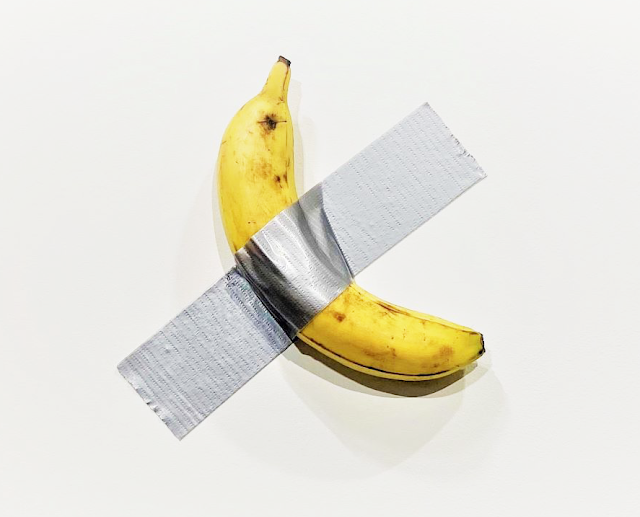
Consider this post is about visual design. A duct taped banana. This piece of art was sold for $150,000 in December 2019 at Miami's Art Basel . Actually $120K x 4 + $150K = $630,000. Not bad for 10 cents banana and few inches of duct tape. This became a sensation of 2019-2020. Why and how it happened brings up some questions about modern society and economy. How artists (or art dealers, or anyone else) create value from nothing? And emphasize the importance of the idea. In this particular case it's nothing more than an idea. Is this the art we'd like to see? Probably not. But perhaps it's the art we deserve.

How do I use InVision

Image
Team lead asked me to write what InVision products do I use, how I use them, what are pros and cons. I wrote it today, and really think it will be helpful to share my thoughts with wider audience. So, below is the adaptation of what I provided to the engineering management in one fintech company.  I use InVision to share my hi-fi designs and specs, which I create in Sketch desktop application. This is my primary and every day usage of InVision, and about 90% of all usecases of all InVision products combined.  I sync designs via the plugin in Sketch made by Invision, called Craft .  When they are in InVision, we call those designs prototypes .  It works, but I often experience slowness. Sometimes sync process is failing, and I have to try it again. In Sketch I select one or more artboards, then initiate sync, which sends the artboard to InVision cloud. I have to be logged in Craft plugin with my InVision credentials. Almost every day, especially when I design intensely and re-publish

Bits and pieces of 5 Senses - Visual Design

Image
The idea here is to promote a healthy life style through educating and producing healthy plant based food. "Making the world healthier." The logo. "5 senses" name is depicted as a young and healthy growing plant with the five buds. Inspired by other "natural and healthy" brands, we also are using earth tones and colors.  Style Guide. Minimal viable styleguide to cover basic needs, as the website and online presence is yet to be established. As you can see it not only follows the earthy colors of the logo but also has simple, easy to read, and widely recognized fonts. Business Cards. These have been designed exclusively for the Raw Vegan speech event. Flyer for the same event. More to be designed! All work is done in Illustrator and Sketch.

Information Architecture - What is it?

Image
Based on the UX team presentation @ Herbalife Nutrition Goals of this post To define what Information Architecture (IA) is.  To define what tasks the Research Team can do in the context of IA.  To define the deliverables.  To create visibility of IA activities within UX team and beyond. What is IA Information architecture (IA) focuses on organizing, structuring, and labeling content in an effective and sustainable way. IA helps to understand how the pieces fit together to create the larger picture, how items relate to each other within the system. The purpose of IA is to help users understand where they are, what they’ve found, what’s around, and what to expect. In other words, IA is an architecture of understanding . IA informs the content strategy through identifying word choice . IA informs UI and interaction design through taking parts in wireframing and prototyping . The information architecture phase of any project is a transitional period that marks the end o

Four tools for prototyping: Sketch, Figma, Principle, and FramerX

Image
Well, five. Because Sketch is not a prototyping tool. Prototyping solution will be Sketch + InVision. On the other hand InVision without Sketch doesn't hold much value, yet. It may be changed with the latest addition - InVision Studio . But let's stick for now with four tools: Sketch, Figma, Principle, and FramerX. The goal of this research is to identify strengths and weaknesses of the tools, and their suitability for the UX team. The main use is to create wireframes and later convert them into interactive prototype. I have chosen these tools because I used them before. The exception is FramerX, which is simply a brand new tool which I wanted to give a chance. No discrimination - there are bunch of other great tools on the market, they are just out of scope of this article. Criteria: Simple click through prototype.  Compatibility with Sketch.  Micro-interactions and animations.  Ease of use.  Collaboration – ability to share, to annotate on UI elements, and to

Using Trello and Confluence to manage UX design project. Part 2

Image
This is part Two. Part One can be found here . Term definitions. Brainstorming board. Activity board. Let me give you an overview of the items we refer to, deal with, and vetting all days long. Below are my simple definitions. UX Brief – a living document, a single and comprehensive point of reference of the design project. User Story – a short requirement or request from the end user. Later will be converted into task flow performed by this user to reach the goal. Acceptance Criteria – a set of conditions/statements, or a checklist, which defines the user story’s Pass/Fail . Feature – a functional part of the application, which combines several user stories. User stories are written to provide a complete support to this feature in terms of tasks performed by the user, while keeping in mind the user’s goal. Epic – a large logical group of multiple features in complex application. Brainstorm – a collaborative session involving product owners (PMs) and UX designers

Using Trello and Confluence to manage UX design project. Part 1

Image
This is part One. Part Two is here . Introduction. “ Describe your design process ”. It’s a typical interview question for UX designer position. User-centered design process indeed has defined set of steps. In theory. On the practice though, the adherence to these steps depends on many factors, such as communication and execution skills, practical experience, ability to influence people, being leader and influencer, and at what level your organization is a design driven org. So many businesses are not ready to adopt the design practice, and to place the design before the development. Or simply there is not time or budget to go through all steps. Here in Herbalife the UX Design team accepted Norman Nielsen group philosophy:   Empathize – Define –Ideate – Prototype – Test – Implement .  However the   interpretation of the practical tasks can differ dramatically in different organizations. Here what we currently do: Design Thinking and Agile Any project, which goes t