Design practice: How fast the transition animation for expandable panels should be
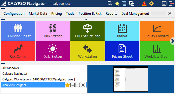
At some point I had an argument with a developer on how fast the transitional animation should be. In our application, Calypso Navigator, we are using a transition animation to give users a feedback of the expanding/collapsing process, and to explain this task visually by drawing more attention to the change.
This software has three main areas, which are collapsible panels: Main Menu, Favorite Tiles, and Windows Manager, as shown below.
[Expanded All screenshot]

[Collapsed All but Main Menu screenshot]

[Collapsed All but Favorite Tiles screenshot]
On my opinion the animation was too slow, at some cases it took about a second, however in my thinking it had to be instantaneous. The argument of the developer was: if it will be that fast, and the user can’t visually track what is changing and how, then the animation doesn’t make sense at all.
I opened Google page attempting to find what professional world’s opinion on this matter is, and found this guideline:
http://msdn.microsoft.com/en-us/library/windows/desktop/aa511285.aspx
Here is the general thought over the use of the animation:
“Strategic use of animations and transitions can make your program easier to understand, feel smoother, more natural, and of higher quality, and be more engaging. But the gratuitous use of animations and transitions can make your program distracting and even annoying.”
So, further reading verbalized what I was thinking intuitively. The animation doesn’t have to affect the user’s productivity. And the first requirement to the speed of the animation is: it has to be quick, precisely: 200 milliseconds or less .
It’s important that the animation is easily ignorable, and doesn’t distract user’s flow. It’s not annoying, overly complex or overly long. It doesn’t create an additional delay: the user doesn’t have to wait to move to the next action. Good animations are not forcing users to watch. No matter how engaging or natural the animation is, nobody wants to wait for them exclusively.
And since Calypso Navigator is the productivity tool, the following applies to it. While a few special experiences can stand out, most other animations should have these characteristics (in the application with the focus on productivity):
• Small
• Natural, realistic
• Subtle, subdued
• Fast, efficient
• Relaxed
I created a special demo of transition animation (with the fade effect) in Calypso Navigator with the speed of 150 milliseconds, which is optimal by my perception:
http://kardash.net/portfolio/Calypso/animation_prototype/animation_prototype_horizontal.html
What do You think about the transitional animation speed?
This software has three main areas, which are collapsible panels: Main Menu, Favorite Tiles, and Windows Manager, as shown below.
[Expanded All screenshot]

[Collapsed All but Main Menu screenshot]

[Collapsed All but Favorite Tiles screenshot]
On my opinion the animation was too slow, at some cases it took about a second, however in my thinking it had to be instantaneous. The argument of the developer was: if it will be that fast, and the user can’t visually track what is changing and how, then the animation doesn’t make sense at all.
I opened Google page attempting to find what professional world’s opinion on this matter is, and found this guideline:
http://msdn.microsoft.com/en-us/library/windows/desktop/aa511285.aspx
Here is the general thought over the use of the animation:
“Strategic use of animations and transitions can make your program easier to understand, feel smoother, more natural, and of higher quality, and be more engaging. But the gratuitous use of animations and transitions can make your program distracting and even annoying.”
So, further reading verbalized what I was thinking intuitively. The animation doesn’t have to affect the user’s productivity. And the first requirement to the speed of the animation is: it has to be quick, precisely: 200 milliseconds or less .
It’s important that the animation is easily ignorable, and doesn’t distract user’s flow. It’s not annoying, overly complex or overly long. It doesn’t create an additional delay: the user doesn’t have to wait to move to the next action. Good animations are not forcing users to watch. No matter how engaging or natural the animation is, nobody wants to wait for them exclusively.
And since Calypso Navigator is the productivity tool, the following applies to it. While a few special experiences can stand out, most other animations should have these characteristics (in the application with the focus on productivity):
• Small
• Natural, realistic
• Subtle, subdued
• Fast, efficient
• Relaxed
I created a special demo of transition animation (with the fade effect) in Calypso Navigator with the speed of 150 milliseconds, which is optimal by my perception:
http://kardash.net/portfolio/Calypso/animation_prototype/animation_prototype_horizontal.html
What do You think about the transitional animation speed?


Comments
Post a Comment